
Table of Contents
Tips for Eye-Catching Food Presentation in Display Cases
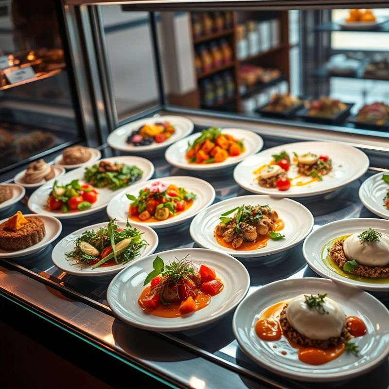
Ever walked into a café or bakery and been instantly drawn to the display case? You know, the one that’s so beautifully arranged that you can’t help but stare, and maybe drool a little? That’s the power of eye-catching food presentation. As someone who’s spent countless hours analyzing (and admittedly, drooling over) display cases, I’ve come to appreciate the art and science behind it. So, let’s dive in and explore how you can create stunning food displays that’ll have customers lining up at the counter.
Living in Nashville, I’ve seen my fair share of amazing food presentations. From the bustling cafés downtown to the quaint bakeries in the suburbs, there’s always something new to discover. And with Luna, my rescue cat, always eager to ‘help’ (read: get in the way), I’ve had plenty of practice trying out different presentation techniques at home.
In this article, we’ll cover everything from the basics of display case arrangement to advanced tips on color theory and prop usage. By the end, you’ll be equipped to create displays that aren’t just eye-catching, but also tell a story and connect with customers on an emotional level. So, grab a coffee (or tea, I don’t discriminate), and let’s get started!
Understanding Your Display Case
Know Your Space
First things first, you need to understand the canvas you’re working with. Display cases come in all shapes and sizes, and the one you have will dictate how you approach your presentation. For instance, do you have a refrigerated case with multiple shelves? Or perhaps a single-level heated case? Maybe you’re working with a simple countertop display. Whatever it is, take note of its dimensions, visibility, and any potential obstructions.
I remember when I first moved to Nashville from the Bay Area, I was blown away by the variety of display cases I saw. From the vintage, rustic cases in the local mom-and-pop shops to the sleek, modern ones in the downtown cafés, each one had its own unique charm. And each one required a different approach to presentation.
Identify Your Focal Points
Every display case has a **’hot spot’** – an area where customers’ eyes naturally gravitate. This is typically at eye level and towards the center. This is where you want to place your **star items**, the ones you really want customers to notice. But be careful not to overcrowd this space. You want it to stand out, not blend in with the rest of the display.
Is this the best approach? Let’s consider… Maybe you want to guide the customer’s gaze on a journey through your display. In that case, you might place your star item off-center, enticing customers to explore the rest of your offerings.
The Art of Arrangement
Create Levels
Flat displays are boring. They lack depth and dimension, and they don’t encourage the eye to explore. Instead, create **levels** using stands, plates, and bowls of varying heights. This not only adds visual interest, but it also allows you to fit more items into your display without it feeling cluttered.
Think about the last time you were at a bakery. Did all the pastries line up like soldiers on a flat tray? Or were they artfully arranged on tiered stands, with some nestled on platters and others propped up on cute little pedestals? I’m guessing it was the latter. And why? Because it catches the eye and makes the display more engaging.
Use the Rule of Thirds
The **rule of thirds** is a classic design principle that helps create visually appealing compositions. Imagine your display case is divided into a 3×3 grid. The points where the lines intersect are where you should place your key items. This creates a more dynamic and interesting display than simply centering everything.
I’ll admit, when I first heard about the rule of thirds, I was skeptical. It seemed too simple to be effective. But then I started noticing it everywhere – in artwork, photography, even in nature. And you know what? It works. There’s just something about that off-center balance that’s pleasing to the eye.
Color Theory 101
Understand the Color Wheel
Color is one of the most powerful tools in your presentation arsenal. It can evoke emotions, stimulate the senses, and even influence purchasing decisions. But to use it effectively, you need to understand the basics of **color theory**.
Remember learning about primary, secondary, and tertiary colors in school? Well, it’s time to put that knowledge to use. **Complementary colors** (colors opposite each other on the color wheel) can create a vibrant, eye-catching display. **Analogous colors** (colors next to each other on the color wheel) can create a harmonious, calming display. And **monochromatic colors** (different shades of the same color) can create a sophisticated, elegant display.
Use Color to Tell a Story
Color isn’t just about aesthetics; it’s also about storytelling. Different colors evoke different emotions and associations. For example, **red** can stimulate the appetite and create a sense of urgency, while **blue** can evoke feelings of trust and calmness. Think about the story you want to tell with your display, and choose your colors accordingly.
Maybe I should clarify… When I say ‘story,’ I don’t mean you need to create some elaborate narrative with your pastries. It’s more about evoking a feeling or setting a mood. For example, a display filled with warm, earthy tones might tell a story of cozy autumn afternoons and comforting treats.
The Power of Props
Choose Props That Enhance Your Theme
Props are more than just filler; they’re an integral part of your display’s storytelling. They can enhance your theme, add context, and make your display more engaging. But be careful not to go overboard. Too many props can make your display feel cluttered and distract from the food itself.
Is this the best approach? Let’s consider… Maybe instead of adding more props, you could choose a few high-impact ones that really reinforce your theme. For example, if you’re going for a rustic vibe, a few well-placed wooden crates or a vintage watering can could do the trick.
Use Texture to Add Interest
Texture is often overlooked in food presentation, but it can add a whole new dimension to your display. Think about the different textures of your props and food items, and how they contrast or complement each other. A smooth, glossy tray can make a rustic loaf of bread stand out, while a rough, textured board can enhance the appeal of a creamy cheese display.
Lighting Matters
Use Light to Guide the Eye
Lighting is crucial in food presentation. It can highlight your star items, create drama, and guide the customer’s eye through your display. But it’s not just about brightness; it’s also about direction and color.
Think about the lighting in your display case. Is it bright and even, casting a uniform glow over everything? Or is it more dramatic, with spotlights highlighting key items and casting intriguing shadows? There’s no right or wrong answer here; it all depends on the story you want to tell.
Consider Color Temperature
Different types of light have different **color temperatures**, which can affect the mood of your display. **Warm light** (around 2700K-3000K) can create a cozy, inviting atmosphere, while **cool light** (around 4000K-5000K) can create a bright, energizing atmosphere. Think about the mood you want to create, and choose your lighting accordingly.
I’m torn between… warm and cool light, but ultimately, it’s about what feels right for your space and your brand. Don’t be afraid to experiment and see what works best.
The Importance of Freshness
Keep It Fresh
This might seem obvious, but it’s worth stating: **freshness is key** in food presentation. Wilted lettuce, dry pastries, and congealed sauces are not going to inspire anyone to make a purchase. Make sure you’re rotating your stock regularly and keeping your display looking fresh and inviting.
But here’s the thing… freshness isn’t just about the food itself. It’s also about the overall look of your display. Even if your pastries are fresh out of the oven, if your display looks tired and uninspired, customers are going to walk right by.
Change It Up
Keeping your display fresh also means **changing it up** regularly. This not only keeps your display looking vibrant, but it also gives customers a reason to come back and see what’s new. Try changing your display weekly, or even daily, depending on your turnover.
Seasonal Displays
Embrace the Seasons
Seasonal displays are a great way to keep your presentations fresh and exciting. They allow you to capitalize on the unique flavors, colors, and themes of each season, creating displays that feel timely and relevant.
Think about the last time you walked into a store and saw a beautiful autumn display, complete with pumpkins, fall leaves, and warm, spicy scents. Didn’t it just make you want to cozy up with a hot drink and a tasty treat? That’s the power of seasonal displays.
Celebrate Holidays
Holidays are another great opportunity to create eye-catching displays. Whether it’s a festive Christmas spread or a spooky Halloween arrangement, holiday displays allow you to tap into the excitement and nostalgia of the season. Plus, they give you an excuse to bring out all your fun, themed props!
I remember one year, I went all out with a Halloween display at home. I had fake spider webs, plastic spiders, and even a creepy-looking ‘poison’ apple pie. Luna, of course, was completely confused by the whole thing, but it was a hit with the trick-or-treaters!
Practical Tips
Use Mirrors to Create Depth
Mirrors aren’t just for checking your reflection; they can also create the illusion of depth in your display case. Place a mirror at the back of your case to make it feel bigger and more spacious. This is especially useful if you’re working with a small display case.
Create a Focal Point with a Chalkboard
A chalkboard can serve as a great **focal point** in your display. It can also be a practical way to communicate information about your offerings. Use it to highlight specials, describe ingredients, or share fun facts. And don’t be afraid to get creative with your chalk art!
In Conclusion
Creating eye-catching food presentations in display cases is both an art and a science. It’s about understanding your space, arranging your items effectively, using color and props to tell a story, and keeping everything looking fresh and inviting. But it’s also about having fun and letting your creativity shine.
So, here’s my challenge to you: Next time you’re arranging your display case, don’t just go through the motions. Really think about the story you want to tell and the experience you want to create. Your customers will notice the difference, and you might just find that you enjoy the process a little bit more, too. Or maybe it’s just me who gets a kick out of playing with my food…
FAQ
Q: What if I don’t have a lot of props to use in my display?
A: Don’t worry! You can still create an eye-catching display using just your food items. Focus on arranging them in interesting ways, using color and texture to create visual appeal.
Q: How often should I change my display?
A: This depends on your turnover and the types of items you’re displaying. But as a general rule, try to change up your display at least weekly to keep it looking fresh and inviting.
Q: What if I’m not good at art or design?
A: You don’t have to be an artist to create a beautiful display. Just follow the basic principles we’ve discussed, and don’t be afraid to experiment and have fun with it. You might surprise yourself with what you can create!
Q: What if I have a small display case?
A: A small display case just means you have to get a little more creative with your arrangements. Use mirrors to create depth, and focus on creating a strong focal point to draw customers in.
@article{tips-for-eye-catching-food-presentation-in-display-cases,
    title   = {Tips for Eye-Catching Food Presentation in Display Cases},
    author  = {Chef's icon},
    year    = {2025},
    journal = {Chef's Icon},
    url     = {https://chefsicon.com/tips-for-eye-catching-food-presentation-in-display-cases/}
} 
