
Table of Contents
- 1 The Nitty-Gritty of Paper: More Than Just a Blank Canvas
- 1.1 So, You Think Paper is Just Paper? Think Again!
- 1.2 The Weight of the World (of Paper): Understanding GSM and Basis Weight
- 1.3 Coated vs. Uncoated: The Great Divide
- 1.4 Let’s Talk Texture: Smooth, Laid, Linen, and Beyond
- 1.5 Brightness and Whiteness: It’s Not All White and Nerdy
- 1.6 Opacity: No Peeking!
- 1.7 Going Green: Recycled and Sustainable Paper Options
- 1.8 Specialty Papers: When You Want to Make a Statement
- 1.9 Matching Paper to Your Project: A Practical Guide (with a Foodie Twist)
- 1.10 Working with Your Printer: Don’t Be Afraid to Ask!
- 2 Wrapping It Up: The Lasting Impression of Paper
- 3 FAQ
Hey everyone, Sammy here, tuning in from my cozy home office in Nashville – Luna, my rescue cat, is currently supervising from her sunbeam spot, probably judging my choice of coffee mug. It’s May 8th, 2025, and the Tennessee spring is really showing off today. Anyway, I was just sifting through a pile of print samples for a potential Chefsicon.com project, and it got me thinking about something we often overlook, or maybe just take for granted: paper. Yeah, paper! It sounds so… basic, right? But let me tell you, as someone who’s spent years in marketing and is now neck-deep in culinary culture and lifestyle branding, the paper you choose for your print projects is like the secret ingredient in a gourmet dish. It can elevate the entire experience, or, if chosen poorly, leave a bland, forgettable taste. We’re talking about understanding paper types for your print projects, and trust me, it’s a deeper rabbit hole than you might think.
I remember this one time, early in my career, we were launching a campaign for a pretty upscale client. The design was killer, the copy was sharp, everything looked amazing on screen. Then the first batch of brochures arrived. And oh boy. They looked… cheap. Limp. The colors seemed dull. The culprit? The paper. Someone, probably trying to save a few bucks, had opted for a flimsy, low-grade stock. It totally undermined the premium message we were trying to send. That was a harsh lesson, but a valuable one. The tactile experience of a printed piece, the way it feels in your hand, the way light reflects off its surface – these things communicate volumes before a single word is even read. It’s a subtle psychological cue that can make or break a first impression, especially in the food world where presentation is paramount. Think about a high-end restaurant menu versus a takeout flyer. The paper alone tells a story.
So, what’s the plan for today? I want to walk you through the often-bewildering world of paper. We’ll touch on weight, finish, texture, brightness, and all those other terms that printers throw around. My goal isn’t to turn you into a paper-making expert overnight, but to give you enough knowledge to ask the right questions, make informed decisions, and ultimately, choose paper that makes your print projects sing. Whether you’re designing a menu for your new café, printing some killer recipe cards, creating marketing materials for your food blog, or even just some personal stationery that doesn’t feel like it came from the bottom of a bargain bin, this is for you. Consider this your friendly guide, from one enthusiast (and occasional paper-hoarder) to another. Let’s get our hands metaphorically inky, shall we?
The Nitty-Gritty of Paper: More Than Just a Blank Canvas
So, You Think Paper is Just Paper? Think Again!
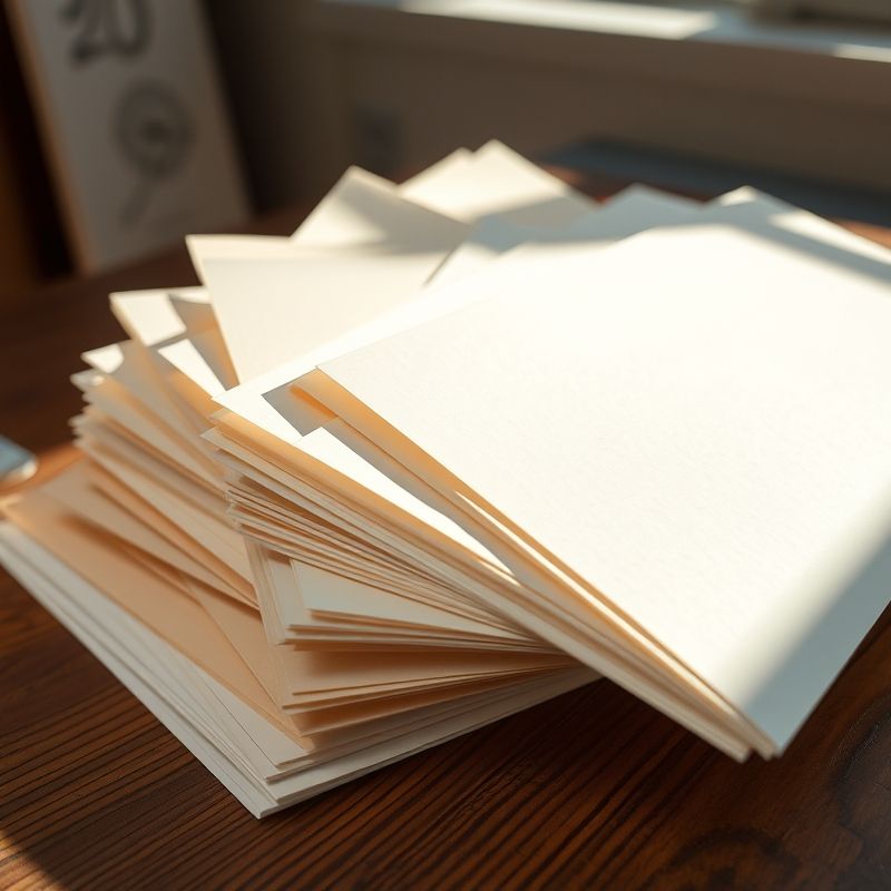
It’s easy to dismiss paper as just the vehicle for your message, the blank space waiting to be filled. But honestly, that’s like saying the plate doesn’t matter when you’re serving a Michelin-star meal. The paper quality itself is a fundamental part of your communication. The moment someone picks up your printed piece, they’re forming an opinion. Is it substantial? Does it feel good? Does it reflect the care and attention you’ve put into what’s printed on it? These are all subconscious assessments that contribute to their overall perception of your brand or your message. In a world saturated with digital content, a physical, tactile piece can really stand out, but only if it’s done well. A flimsy business card, for instance, might suggest a flimsy business, regardless of how brilliant your logo is. It’s that initial touchpoint that sets the tone. I mean, imagine getting a wedding invitation on paper that feels like it could tear if you breathe on it too hard. It just doesn’t convey ‘special occasion,’ does it?
For those of us in the food and lifestyle space, this is even more critical. Think about the sensory experience of food – taste, smell, sight, and yes, even touch. A beautifully designed menu on a luxurious, textured stock can enhance the anticipation of a fine dining experience. A cookbook with thick, matte pages that feel good to turn invites you to spend time with it, to dog-ear your favorite recipes. This is all part of brand identity. The paper you choose should align with the story you’re trying to tell. Is your brand rustic and earthy? Maybe an uncoated, recycled stock with visible fibers is the way to go. Are you all about modern luxury? Perhaps a sleek, smooth, heavyweight coated paper would be more appropriate. It’s a form of tactile marketing that often flies under the radar but has a significant impact. I’ve seen amazing restaurants with fantastic food slightly let down by menus printed on what felt like cheap copier paper. It’s a missed opportunity to reinforce their quality at every touchpoint. It sounds like a small detail, but these small details accumulate to create a powerful overall impression.
The Weight of the World (of Paper): Understanding GSM and Basis Weight
Alright, let’s talk about one of the first things you’ll encounter when choosing paper: its weight. This can be surprisingly confusing because you’ll hear terms like GSM (Grams per Square Meter) and Basis Weight (often in pounds, like ’80lb text’ or ‘100lb cover’). They’re essentially two different systems for measuring the same thing: how heavy, and therefore often how thick and sturdy, a sheet of paper is. GSM is the metric standard and is pretty straightforward – it’s the actual weight of a square meter of that paper. So, a 300 GSM paper is heavier (and generally thicker and stiffer) than a 120 GSM paper. Easy peasy, right?
Then there’s Basis Weight, which is more common in North America. This is where my brain used to do a little flip. Basis weight is the weight of a ream (500 sheets) of paper in its traditional ‘basis’ or ‘parent’ sheet size, which varies depending on the *type* of paper. For example, the basis size for ‘bond’ paper (like your typical office copier paper) is different from ‘text’ paper (used for brochures, book pages) and ‘cover’ paper (for business cards, report covers, postcards). This means that 80lb text paper is NOT the same thickness or stiffness as 80lb cover paper. In fact, 80lb cover is significantly thicker and heavier than 80lb text. It can even be heavier than 100lb text! Confusing, I know. I remember staring at sample books for ages, trying to get a feel for it. My advice? When in doubt, ask for samples or refer to a conversion chart that shows GSM equivalents. Generally, higher numbers within the same category (e.g., comparing two ‘text’ weights or two ‘cover’ weights) mean heavier, thicker paper. For instance, a standard flyer might be 120-150 GSM (around 80lb text), while a business card would be more like 300-400 GSM (110-140lb cover). The paper thickness impacts not just the feel but also durability and the dreaded see-through if you’re printing on both sides. Don’t just go by numbers; feel the samples. It’s the only way to truly understand.
Coated vs. Uncoated: The Great Divide
This is a big one. Probably one of the most fundamental choices you’ll make: coated paper or uncoated paper. They look different, they feel different, and they interact with ink in very different ways. Coated papers have a surface sealant, typically made of clay or other polymers. This coating fills the tiny pits and fibers of the raw paper, creating a smoother, less porous surface. The result? Ink tends to sit on top of the coating rather than soaking in. This means images often look sharper, colors appear more vibrant and punchy, and you can achieve finer detail. Coated papers come in several finishes: gloss finish (very shiny, great for photo-heavy pieces where you want colors to pop, but can have glare), matte finish (smooth but non-shiny, offers good color reproduction without the glare, often seen as more elegant or modern), and silk or satin (a nice in-between, with a subtle sheen). Think magazines, high-end brochures, art books – they often use coated stocks.
On the other side of the ring, we have uncoated paper. As the name suggests, there’s no surface coating. The paper fibers are more exposed, giving it a more natural, often slightly rougher or more textured feel. Ink soaks into uncoated paper more, which can result in slightly softer, more muted colors. This isn’t necessarily a bad thing! It can create a warm, inviting, or artisanal look. Uncoated paper is generally easier to write on, making it ideal for stationery, notebooks, letterheads, and the inside pages of many books. It often feels more ‘organic’ or ‘authentic’. I personally love a good uncoated stock for things like recipe cards or a thoughtfully written note. It just feels more personal. The choice between coated and uncoated really depends on your project’s goals and your brand’s aesthetic. Are you aiming for slick and vibrant, or warm and tactile? There’s no right or wrong, just different tools for different jobs. Sometimes I find myself just running my fingers over different samples, almost like I’m trying to absorb their personality. Luna just watches, probably thinking I’ve finally cracked.
Let’s Talk Texture: Smooth, Laid, Linen, and Beyond
Okay, so we’ve covered weight and coatings, but what about the actual feel, the surface characteristic? This is where paper texture comes into play, and it’s another fantastic way to add personality and a premium touch to your print projects. Beyond the general distinction of coated (usually smoother) and uncoated (can have more inherent texture), there’s a whole world of specific textures you can choose from, especially with specialty papers. A ‘smooth’ finish is just that – very even, with minimal surface variation. It’s great for crisp text and detailed images. Then you have ‘vellum’ finish, which, confusingly, isn’t usually translucent like true vellum (made from animal skin historically), but rather refers to a smooth, toothy, uncoated finish. It’s quite popular for its nice feel.
But then things get more interesting! ‘Laid’ paper has a distinctive ribbed texture, with fine parallel lines impressed into it during manufacturing. It gives a very classic, traditional, almost handmade feel – lovely for formal invitations or distinguished letterheads. ‘Linen’ finish mimics the look and feel of linen fabric, with a subtle crosshatch pattern. It adds a touch of elegance and sophistication, often used for business stationery or menus. You can also find ‘felt’ finishes, which have a softer, slightly fuzzy texture, or ‘wove’ which is a more uniform, slightly textured uncoated finish. And then there’s Kraft paper, with its rustic, brown, often slightly rough texture, perfect for organic brands or anything wanting an earthy vibe. I once got a sample book that was like a tactile adventure. I swear, Luna was more interested in the box it came in, but I was fascinated. The texture of the paper can completely change the perception of a design. A simple logo can look incredibly sophisticated on a beautifully textured stock. It’s one of those finish types that can speak volumes without shouting. It’s about engaging more than just the eyes; it’s about the sense of touch, which is so powerful.
Brightness and Whiteness: It’s Not All White and Nerdy
You’d think white paper is just… white, right? Oh, if only it were that simple. When you start looking at paper specs, you’ll encounter terms like paper brightness and shades of white. Brightness usually refers to the percentage of light a paper reflects, measured on a scale from 1 to 100. A higher brightness (say, 92-98) means the paper will appear whiter and brighter, making colors printed on it seem more vivid and text appear to have higher contrast, which can improve readability. This is often achieved by adding optical brightening agents (OBAs) during manufacturing. These OBAs absorb UV light and re-emit it as blue light, making the paper appear ‘whiter than white’. Think of those super bright white copier papers.
However, ‘whiteness’ also refers to the actual *shade* of white. Some papers have a cool, blue-white cast (often those with high brightness and OBAs). Others might be a ‘balanced’ or ‘true’ white. And then you have warmer shades, like natural white, soft white, or cream, which have a yellowish or off-white tint. These can lend a softer, more vintage, or more approachable feel to a printed piece. The choice of whiteness can significantly affect color reproduction. A blue-white paper will make cool colors pop but might slightly alter warm tones. A cream paper will add warmth to everything printed on it. There’s no single ‘best’ white; it depends on the mood you want to create and how you want your colors to appear. I always recommend looking at samples under good lighting conditions, ideally the same kind of lighting where your final piece will be viewed. It’s amazing how different ‘whites’ can look side by side. It’s a subtle thing, but your eyes definitely pick up on it, even if you’re not consciously analyzing it.
Opacity: No Peeking!
This one is crucial, especially if you’re planning on printing on both sides of the paper: opacity. Opacity is simply a measure of how see-through a paper is. High opacity means less show-through from the printing on the reverse side or the sheet underneath. Low opacity means you might see a ghostly image of what’s printed on the back, which can be distracting and make your piece look cheap or poorly planned. Imagine reading a book where the text from the next page is visible through the current one – super annoying, right? Or a brochure where the image on one side muddies the text on the other.
Several factors influence a paper’s opacity. Generally, heavier and thicker papers tend to be more opaque. Fillers added during papermaking, like clay or titanium dioxide, also increase opacity. Some coatings can help too. Uncoated papers, especially lighter ones, can sometimes be more prone to show-through if they don’t have enough bulk or fillers. When you’re selecting paper for double-sided printing, always check its opacity rating if available, or better yet, get a printed sample on that specific stock to see for yourself. If a rating isn’t available, a good rule of thumb is that if you hold a sheet up to the light and can clearly read text from a sheet behind it, you might have an issue. For things like book pages, thin catalog pages, or any double-sided document where clarity is key, good opacity is a non-negotiable. It’s one of those technical details that makes a huge difference in the final professional look and readability of your project. You want people focusing on your content, not squinting to ignore the print bleeding through from the other side.
Going Green: Recycled and Sustainable Paper Options
Living in Nashville, a city that really embraces creativity and often, a mindful approach to living, I’m always trying to consider the environmental impact of my choices. And paper is a big one. The good news is that there are more recycled paper and sustainable options available than ever before. Choosing these can be a great way to align your print projects with eco-conscious values. When you see ‘recycled paper,’ it often specifies the percentage of PCW content, which stands for Post-Consumer Waste. This is the good stuff – paper that has been used by consumers, collected through recycling programs, and then re-pulped to make new paper. A higher PCW percentage generally means a more environmentally friendly choice. You can find papers with anything from 10% to 100% PCW content.
Beyond recycled content, look for certifications like FSC certified (Forest Stewardship Council). This means the paper comes from responsibly managed forests, where trees are harvested sustainably, and biodiversity is protected. There are other certifications too, like SFI (Sustainable Forestry Initiative). It’s worth doing a little research. Now, there used to be a perception that recycled papers weren’t as bright or as high quality as virgin fiber papers. And while that might have been true to some extent years ago, modern recycled papers can be fantastic. They come in a wide range of brightness levels, finishes, and weights. Yes, sometimes 100% PCW papers might have tiny visible flecks or a slightly less uniform appearance, but that can also be part of their charm, adding character and visibly communicating your commitment to sustainability. However, it’s a balance. Sometimes a specific design really demands a super bright white or a particular finish that’s harder to achieve with high recycled content. It’s about making informed choices and finding the best fit for both your project’s needs and your environmental goals. And don’t forget to let people know you’re using sustainable paper – a small note or logo can speak volumes about your brand’s values.
Specialty Papers: When You Want to Make a Statement
Sometimes, standard coated or uncoated paper just won’t cut it. Sometimes you need something that screams ‘special,’ something that makes an unforgettable first impression. This is where specialty papers and premium paper options come into the picture. We’re talking about papers that have unique characteristics, finishes, or even materials. For instance, ‘pearlescent’ papers have a shimmery, iridescent finish that catches the light beautifully – perfect for high-end invitations or luxury packaging. ‘Metallic’ papers offer a similar reflective quality but with a more solid metallic sheen, like gold, silver, or bronze. These can add a real touch of glamour.
Then there’s synthetic paper. This isn’t paper in the traditional sense, as it’s often made from polypropylene or other plastics. The major advantages? It’s incredibly durable, tear-proof, and waterproof. Think about restaurant menus that need to withstand spills and constant handling – synthetic paper is a game-changer. Or outdoor banners, maps, or ID cards. You can also find translucent papers (like vellums or tracing papers) that can be used for elegant overlays or unique design effects. Some companies even make ‘seed paper,’ which is embedded with wildflower seeds. After the paper has served its purpose, you can plant it, and it will grow! How cool is that for an eco-friendly promotion? Of course, these specialty papers usually come with a higher price tag. Are they always necessary? Definitely not. But for that one project where you really need to pull out all the stops – a wedding invitation, a portfolio cover, a super-luxe product tag – they can be worth the investment. They signal extra care, extra thought, and a willingness to go beyond the ordinary. It’s about creating a memorable tactile and visual experience.
Matching Paper to Your Project: A Practical Guide (with a Foodie Twist)
Okay, theory is great, but how does this all apply to real-world projects? Let’s break down some common print application examples, especially with a nod to my fellow food and lifestyle enthusiasts. Think of it like pairing wine with food; the paper has to complement the content, not fight with it or underwhelm it. For business card stock, you want something sturdy and memorable. Nobody likes a limp-fish handshake, and nobody likes a limp-fish business card. Go for a heavier cover stock, at least 300 GSM (around 110-130lb cover). Consider a nice texture or a subtle finish to make it stand out. For menu paper, durability and readability are paramount. If it’s a multi-page menu, a slightly lighter weight might be okay for inner pages, but the cover should be robust. Coated stocks are often preferred because they resist smudges and can be wiped down (a lifesaver in a busy restaurant!). Matte or silk coatings are great for readability under restaurant lighting. Or, as mentioned, synthetic paper is an excellent, albeit pricier, option for ultimate durability. Lamination can also extend the life of a paper menu.
For brochures and flyers, you’re often balancing cost with impact. A mid-weight text stock, say 150-200 GSM (around 100lb text), often works well. A coated stock (gloss or silk) will make images and colors pop, which is great for promotional material. If you’re creating high-end invitations or personal stationery, this is where you can indulge in quality. Heavier text weights or light cover stocks, often uncoated for writability and a tactile feel, are perfect. Think laid, linen, or a beautiful cotton paper. And for my beloved recipe cards or cookbooks? You want good readability, so a matte or uncoated stock is often best to avoid glare. It should also be durable enough to withstand some kitchen action – maybe not a direct tomato sauce hit, but at least frequent handling. A decent weight, perhaps 200-250 GSM, would feel substantial. The key is to always think about the end-use and the impression you want to create. What’s the journey of this printed piece? Who will hold it? What do you want them to feel?
Working with Your Printer: Don’t Be Afraid to Ask!
This might be one of the most crucial pieces of advice I can give you: talk to your print provider. Seriously. These folks are experts in their field. They handle paper all day, every day. They know what works, what doesn’t, what’s new, what’s cost-effective, and what might cause unexpected issues with your design. Don’t just send off your files and hope for the best. Have a conversation. Tell them about your project, your goals, your budget, and the kind of look and feel you’re aiming for. They can offer invaluable advice on paper choices, perhaps suggesting stocks you hadn’t even considered. Always, always, *always* ask for paper samples. Not just unprinted swatches (though those are helpful for feeling weight and texture), but if possible, get a printed proof of your actual design on the exact paper stock you’re considering. This is called a ‘hard proof’ or ‘press proof’ (though a full press proof can be expensive; a high-quality contract proof on the chosen stock is often sufficient).
I learned this the hard way years ago. I had this beautiful design with subtle gradients and dark, rich colors. It looked amazing on my screen. I chose an uncoated stock because I wanted that natural feel. When the final prints arrived, the colors looked muddy, and the gradients were blotchy. The ink had soaked into the uncoated paper too much and spread, losing all the fine detail. A simple printed proof would have caught that, and I could have adjusted the design or chosen a different, perhaps smoother or lightly coated, stock. Printers often have ‘house stocks’ which are papers they buy in bulk and can offer at a better price. These are often excellent quality and worth considering. But don’t be afraid to ask about other options. Good communication with your printer is key to avoiding costly mistakes and ensuring your final piece looks as good in reality as it does in your head. They are your partners in bringing your vision to life, so use their expertise!
Wrapping It Up: The Lasting Impression of Paper
Phew! We’ve journeyed through the weights, finishes, textures, and a whole lot more in the world of paper. It’s a lot to take in, I know. Maybe more than you ever thought there was to know about something as seemingly simple as paper. But my hope is that you’re now looking at that humble sheet with a newfound appreciation for its potential. It’s not just a substrate; it’s an active participant in your communication, a tactile ambassador for your brand or your message. Choosing the right paper is an art and a science, a blend of understanding the technical properties and intuiting the emotional impact.
So, next time you embark on a print project, whether it’s for your burgeoning food blog, your Nashville-based artisanal pickle company (hey, a guy can dream!), or even just some personal thank-you notes, I challenge you to pause and really *think* about the paper. Don’t let it be an afterthought. Request samples. Feel them. Hold them up to the light. Imagine your design on them. Consider the message you want to send before a single word is read. Is this the best approach? Well, I think really considering all the elements of your project, paper included, is always a good path. It’s these thoughtful details that can elevate your work from ‘good’ to ‘unforgettable’.
And as I sit here, with Luna now batting at a stray paper sample on my desk, I can’t help but wonder: in our increasingly digital, screen-focused lives, what role will the physical, tactile nature of paper play in the future of how we connect and communicate? Will its significance diminish, or will its ability to offer a tangible, sensory experience make it even more precious? I suspect the latter, but then again, I’m just a marketing guy who gets overly enthusiastic about good cardstock. What do you think?
FAQ
Q: What’s the biggest mistake people make with paper choice for print projects?
A: I’d say one of the most common pitfalls is choosing paper based solely on price without considering the project’s overall goals or the brand’s image. Another big one is not getting a physical sample, or even better, a printed proof on the chosen stock. What looks good in a swatch book or on a screen can behave very differently once ink hits it. Underestimating the impact of weight and finish on the perceived quality is also pretty common.
Q: Is heavier paper always better?
A: Not necessarily! While heavier paper often conveys a sense of quality and durability, it’s not always the right choice for every application. For example, a multi-page brochure or the inside pages of a book might become too bulky or difficult to handle if the paper is excessively heavy. Heavier paper also costs more to print and potentially to mail. The key is appropriateness: a business card benefits from heavy stock, but a delicate wedding invitation insert might call for something lighter and more refined. Context is everything.
Q: How much does paper choice really affect the final cost of a print project?
A: It can have a pretty significant impact, actually. Basic ‘house stocks’ that printers buy in large quantities are generally the most budget-friendly. As you move into premium papers with special finishes, unique textures, high recycled content, or heavier weights, the cost per sheet can increase substantially. For large print runs, even a small difference in paper cost per sheet can add up. It’s always a good idea to discuss your budget with your printer, as they can often suggest alternatives that give a similar feel or quality within your price range.
Q: Can I really tell the difference between various paper types if I’m not a designer?
A: Absolutely! You might not know all the technical terms initially, but your senses are very attuned to differences in weight, texture, smoothness, and even the way paper reflects light. Once you start consciously paying attention and handling different samples, the distinctions become surprisingly obvious. Think about the difference between a flimsy newspaper and a high-quality magazine, or a standard copier paper and a thick, textured wedding invitation. You can feel it. It’s a bit like developing a palate for good coffee or craft beer – the more you experience, the more nuances you appreciate!
@article{choosing-paper-your-print-projects-secret-ingredient,
    title   = {Choosing Paper: Your Print Project’s Secret Ingredient},
    author  = {Chef's icon},
    year    = {2025},
    journal = {Chef's Icon},
    url     = {https://chefsicon.com/understanding-paper-types-for-your-print-projects/}
} 

