The Best Fluffy Pancakes recipe you will fall in love with. Full of tips and tricks to help you make the best pancakes.
Table of Contents
- 1 The Great Recipe Scroll: Why Does This Happen?
- 1.1 The SEO Game (and How It Affects *You*)
- 1.2 The Personal Brand Paradox
- 1.3 The Monetization Maze
- 1.4 The Psychology of Anticipation (and Frustration)
- 1.5 The Illusion of Authority
- 1.6 The Mobile Experience (or Lack Thereof)
- 1.7 The ‘Just Scroll Down’ Defense (and Why It Doesn’t Hold Up)
- 1.8 The Call for Simplicity (and Sanity)
- 1.9 The Future of Online Recipes (A Hopeful Prediction)
- 1.10 My Personal Challenge (and Maybe Yours Too?)
- 2 Wrapping It Up: A Recipe for Change
- 3 FAQ
- 4 You Might Also Like
Ever find yourself scrolling, and scrolling, *and scrolling* just to get to the actual recipe on a food blog? Yeah, me too. It’s like they’re building a fortress of text around a simple list of ingredients and instructions. And honestly, it’s 2025, and I’m *still* dealing with this. As someone who’s been both in marketing *and* obsessed with food forever, I’ve got some thoughts – and maybe a little bit of a rant – about why this happens and what it really means.
I moved from the Bay Area to Nashville a while back, and let me tell you, the food scene here is a whole different kind of vibrant. It’s less about chasing the next tech-fueled trend and more about, well, *soul*. And that got me thinking: Shouldn’t online recipes be more about the soul of the food, too? Instead, we often get these endless narratives that feel… disconnected. It’s not that the stories aren’t sometimes interesting, it’s that they often feel like a barrier to what I’m actually there for: the cooking!
This article is my deep dive into that frustration. I’ll explore the reasons behind these ‘walls of text,’ look at it from a few different angles (marketing, user experience, even a little bit of psychology), and maybe, just maybe, offer some thoughts on how we – both as readers and content creators – can do better. Because, at the end of the day, we all just want to make and enjoy some good food, right? My rescue cat, Luna, certainly agrees – especially when it involves chicken.
The Great Recipe Scroll: Why Does This Happen?
The SEO Game (and How It Affects *You*)
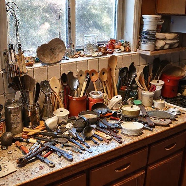
Okay, let’s get the obvious one out of the way first: Search Engine Optimization (SEO). Websites want to rank high on Google, and one way to do that is by having a lot of content. More words, more chances for keywords, more ‘relevance’ in the eyes of the algorithm. It’s a system, and food bloggers are playing the game. The problem is, it often feels like *we*, the readers, are the ones paying the price. We’re sifting through paragraphs about Aunt Mildred’s childhood in rural Ohio just to find out how much baking soda to use. Keyword density is the name of the game, and sometimes, user experience takes a backseat.
It’s a bit of a vicious cycle. Google’s algorithm, in trying to deliver the ‘best’ results, inadvertently encourages this behavior. And because so many sites do it, it becomes the norm. Even if a blogger *wanted* to just post a simple recipe, they might feel pressured to add all that extra fluff to compete. It’s a classic example of a system optimizing for one thing (search rankings) at the expense of another (user satisfaction). Is this sustainable? I’m not so sure.
And let’s be real, the assumption that longer content automatically equals better content is flawed. A concise, well-written recipe can be just as valuable, if not more so, than a rambling essay. But the current SEO landscape doesn’t always reward that. It’s something I think about a lot, especially working in marketing. How do we balance the need to be found with the desire to be, you know, *useful*?
Think about it from a restaurant kitchen design perspective. You wouldn’t put the pantry on the opposite side of the building from the prep area, right? That would be incredibly inefficient. Similarly, burying the recipe at the bottom of a long page creates unnecessary steps for the user. It slows things down, and in the fast-paced world we live in, that’s a major turn-off. Space optimization is key in a physical kitchen, and it should be online, too.
The Personal Brand Paradox
Another factor is the rise of the ‘personal brand.’ Food bloggers aren’t just sharing recipes; they’re building a brand around themselves, their lives, their stories. And that’s fine, to a point. It’s great to connect with the person behind the food. But when the personal narrative overshadows the recipe itself, it becomes a problem. It’s like going to a restaurant and having the chef spend 20 minutes telling you their life story before you even get to order.
I’ve noticed a trend towards what I call ‘aspirational blogging.’ It’s not just about the food; it’s about the *lifestyle*. The perfectly styled kitchen, the idyllic family gathering, the curated aesthetic. It’s all very appealing, but it can also feel… performative. And again, it creates a distance between the reader and the recipe. We’re not just learning how to make a dish; we’re being sold a dream. And sometimes, that dream feels a little too far removed from my own reality, here in my Nashville home with Luna shedding fur on everything.
The challenge, I think, is to find a balance. How do you build a personal brand without sacrificing the core value of your content – the recipes? How do you share your story in a way that feels authentic and engaging, without overwhelming the practical information that people are actually seeking? It’s a delicate dance, and not everyone gets it right. I certainly don’t claim to have all the answers, but it’s something I’m constantly grappling with.
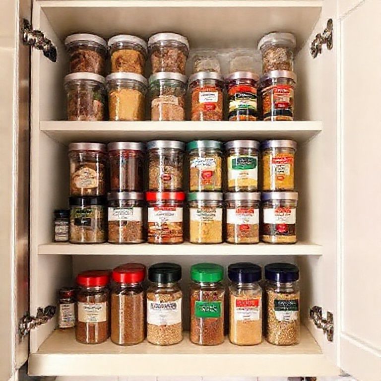
This is where the concept of user-centric design comes in. It’s about putting the needs of the user first. If you’re designing a commercial kitchen, you think about the flow of work, the placement of equipment, the ease of access. The same principles should apply to website design. If people are coming to your site for recipes, make the recipes easy to find! It seems obvious, but it’s often overlooked.
The Monetization Maze
Let’s talk money. Food blogs aren’t just passion projects; they’re often businesses. And to make money, they need to generate traffic and keep people on their site. Longer content can mean more opportunities for ad placements. The longer you scroll, the more ads you see, the more revenue the blogger generates. It’s a simple equation, but it can lead to a frustrating user experience.
There’s also the issue of affiliate links. Bloggers often earn commissions by recommending products or services. And, of course, they want to weave those recommendations naturally into their content. But sometimes, it feels like the recipe is just an excuse to sell you something. The focus shifts from the food to the products, and the whole experience starts to feel… transactional. It’s a tricky balance, because bloggers *do* need to make a living. But there’s a way to do it that feels ethical and respectful of the reader’s time and attention.
I’ve been exploring different monetization models myself, trying to find ways to support my work without compromising the integrity of the content. It’s not easy. There’s a constant tension between the need to generate revenue and the desire to provide a positive user experience. And honestly, I think we need to have a more open conversation about this in the blogging community. How can we create sustainable business models that don’t rely on these ‘walls of text’?
Consider the parallels with restaurant equipment financing. Restaurants need to invest in quality equipment to succeed, but they also need to manage their cash flow. There are different financing options available, each with its own pros and cons. Similarly, food bloggers need to find the right balance between monetizing their content and providing value to their readers. There’s no one-size-fits-all solution, but transparency and user-centricity should be guiding principles. Chef’s Deal, for example, offers free kitchen design services, which can be a huge help for restaurants trying to optimize their space and budget. It’s an example of a value-added service that benefits both the supplier and the customer.
The Psychology of Anticipation (and Frustration)
There’s a psychological aspect to all of this, too. When we’re looking for a recipe, we’re often in a state of anticipation. We’re excited about the prospect of making something delicious. But that anticipation can quickly turn to frustration if we have to wade through a lot of irrelevant content. It’s like being on a treasure hunt, but the clues are buried under piles of unrelated stuff.
There’s a concept in psychology called ‘cognitive load.’ It refers to the amount of mental effort required to process information. When we’re faced with a wall of text, our cognitive load increases. We have to work harder to find what we’re looking for, and that can lead to fatigue and frustration. It’s the opposite of what a good user experience should be.
I think about this in relation to my own cooking habits. When I’m in the kitchen, I want things to be streamlined and efficient. I don’t want to be fumbling around looking for ingredients or instructions. I want everything to be readily accessible. And the same should be true of online recipes. We should be able to find the information we need quickly and easily, without having to expend unnecessary mental energy.
This relates to the principles of HACCP (Hazard Analysis and Critical Control Points) in food safety. HACCP is all about identifying potential hazards and implementing controls to prevent them. In a commercial kitchen, this means ensuring that food is stored, handled, and prepared safely. But the same principles can be applied to website design. We can identify potential ‘hazards’ – like long, rambling content – and implement ‘controls’ – like clear navigation and concise writing – to prevent user frustration.
The Illusion of Authority
Sometimes, I wonder if these long introductions serve another purpose: to establish authority. By sharing personal stories and detailed explanations, bloggers might be trying to position themselves as experts, as people whose opinions should be trusted. It’s a way of saying, ‘I know what I’m talking about, so you should listen to me.’ And there’s nothing inherently wrong with that. But it can feel a bit… heavy-handed, especially when all we want is a simple recipe.
It’s like the difference between a seasoned chef and a culinary school graduate. The seasoned chef has years of experience, but they don’t need to constantly remind you of that. Their expertise is evident in their cooking. The culinary school graduate, on the other hand, might feel the need to prove themselves, to demonstrate their knowledge. And sometimes, that can come across as overcompensating.
I think there’s a lesson here for bloggers. True authority comes from providing value, from consistently delivering high-quality content. It’s not about telling people how much you know; it’s about *showing* them. And that can be done through a well-written recipe, a helpful tip, a thoughtful reflection. It doesn’t require a wall of text.
The Mobile Experience (or Lack Thereof)
Let’s not forget the mobile experience. Most people are accessing recipes on their phones these days. And scrolling through a long, text-heavy page on a small screen is even *more* frustrating than on a desktop. It’s a recipe for thumb cramps and eye strain.
Mobile-first design is crucial in today’s digital landscape. Websites need to be optimized for smaller screens, with clear navigation and a focus on essential information. That means prioritizing the recipe itself, and making it easy to find and follow. It might also mean rethinking the traditional blog post format, and exploring alternative ways of presenting content, like videos, interactive elements, or step-by-step photos.
Think about a food truck. Space is extremely limited, so every inch counts. The layout has to be incredibly efficient, with everything in its place and easily accessible. The same principle applies to mobile website design. You have limited screen real estate, so you need to make the most of it. That means cutting out the unnecessary fluff and focusing on what matters most: the recipe.
I’ve been experimenting with different mobile layouts for my own site, trying to find ways to improve the user experience. It’s an ongoing process, and I’m constantly learning and adapting. But the goal is always the same: to make it as easy as possible for people to find and use my recipes, regardless of the device they’re using. And I encourage all recipe bloggers to keep that in mind – and maybe invest in a good website design expert.
The ‘Just Scroll Down’ Defense (and Why It Doesn’t Hold Up)
You’ll often hear the argument, ‘If you don’t want to read the story, just scroll down to the recipe!’ And on the surface, that seems reasonable. But it misses the point. It’s not just about the *ability* to scroll; it’s about the *effort* required. It’s about respecting the reader’s time and attention. It’s about creating a user experience that is intuitive and enjoyable, not one that feels like an obstacle course.
It’s also a matter of principle. Why should we have to sift through irrelevant content to get to what we’re actually looking for? It’s like going to a grocery store and having to walk through the entire store to get to the milk. Sure, you *can* do it, but it’s not exactly a pleasant experience. A well-designed store puts the most frequently purchased items in easily accessible locations.
The ‘just scroll down’ defense is a bit like saying, ‘If you don’t like the traffic, just take a different route.’ It’s a deflection, not a solution. The real solution is to address the root cause of the problem: the unnecessary ‘walls of text’ that are cluttering up online recipes. A well-designed site will consider traffic flow, similar to a restaurant kitchen, and ensure that the user’s journey is smooth and efficient.
The Call for Simplicity (and Sanity)
So, what’s the alternative? I believe it’s a return to simplicity. A focus on clear, concise, well-written recipes that are easy to find and follow. A respect for the reader’s time and attention. A recognition that not every recipe needs a lengthy personal narrative.
It’s about embracing the essence of the food itself. Letting the ingredients and the techniques speak for themselves. Creating a space where the focus is on the joy of cooking and sharing, not on self-promotion or SEO games. It’s a shift in mindset, a move away from the ‘more is more’ approach that has dominated the online food world for too long.
I’m not saying that personal stories have no place in food blogging. They can be a wonderful way to connect with readers and add context to a recipe. But they should be *optional*, not *obligatory*. They should enhance the recipe, not overshadow it. They should be offered as a side dish, not the main course.
Think of it like a well-designed commercial kitchen. Everything has its place, and everything is organized for maximum efficiency. There’s a clear separation between the prep area, the cooking area, and the service area. The same principles should apply to online recipes. The recipe itself should be the focal point, with any additional content clearly separated and easily accessible for those who are interested. Chef’s Deal, for example, emphasizes comprehensive kitchen design and equipment solutions, which is exactly the kind of streamlined approach we need in the online recipe world.
The Future of Online Recipes (A Hopeful Prediction)
I’m optimistic that things are changing. I see a growing awareness of the issues I’ve discussed, and a desire for a more user-friendly approach to online recipes. I see more bloggers experimenting with different formats, prioritizing clarity and conciseness. I see more readers demanding a better experience.
I believe the future of online recipes will be more interactive, more visual, and more personalized. I envision recipes that adapt to the user’s skill level, dietary needs, and available ingredients. I see a greater emphasis on video content, step-by-step photos, and user-generated feedback. I see a move away from the one-size-fits-all approach, and a greater focus on individual preferences.
Technology will play a big role in this evolution. We’ll see more sophisticated search algorithms that prioritize user experience, not just keyword density. We’ll see AI-powered tools that can help bloggers create more engaging and efficient content. We’ll see new platforms and formats that challenge the traditional blog post structure. I think of the various smart kitchen systems that are becoming available, and I imagine a similar level of innovation coming to online recipes.
My Personal Challenge (and Maybe Yours Too?)
So, here’s my challenge to myself, and maybe to you, too: Let’s strive for simplicity. Let’s prioritize clarity and conciseness. Let’s respect our readers’ time and attention. Let’s create online recipes that are a joy to use, not a chore to navigate. Let’s focus on the food, and let the stories be a bonus, not a barrier.
It’s not about abandoning personal expression or creativity. It’s about finding a better balance. It’s about creating a more sustainable and user-friendly online food world. It’s about remembering why we’re all here in the first place: to share our love of food and cooking. And maybe, just maybe, to make the internet a little bit less frustrating, one recipe at a time.
I’m not sure if this will completely revolutionize the online recipe world, but I’m committed to trying. And I hope you’ll join me. Because, honestly, we all deserve better than those endless walls of text. Right?
Wrapping It Up: A Recipe for Change
We’ve covered a lot of ground, from SEO tactics to the psychology of frustration. The bottom line? Online recipes often suffer from an overload of unnecessary content, and it’s impacting the user experience. It’s a complex issue with roots in marketing strategies, personal branding, and even the way we think about authority. But the solution, I believe, lies in a return to simplicity and a greater focus on the needs of the reader.
Whether you’re a food blogger, a recipe user, or just someone who loves to cook, I hope this article has given you some food for thought. Let’s work together to create a more user-friendly online food world, one where recipes are easy to find, easy to follow, and a joy to use. It’s a challenge, but it’s one worth taking on. And who knows, maybe we’ll even inspire some changes in the way search engines rank content. Wouldn’t that be something?
FAQ
Q: Why do food bloggers write so much before the recipe?
A: There are several reasons, including SEO (Search Engine Optimization), building a personal brand, monetization strategies (ads and affiliate links), and attempting to establish authority. Often, it’s a combination of these factors.
Q: Is it okay to just scroll down to the recipe?
A: Technically, yes, but it shouldn’t be necessary. It’s a matter of respecting the reader’s time and creating a user-friendly experience. Good website design should prioritize the recipe and make it easy to find.
Q: Will online recipes ever change?
A: I’m optimistic that they will. There’s a growing awareness of the issue, and I believe technology and user demand will drive changes towards a more streamlined and user-friendly approach.
Q: What can I do as a reader?
A: You can support bloggers who prioritize clear and concise recipes. You can provide feedback to bloggers (respectfully, of course!). And you can share your thoughts on social media, helping to raise awareness of the issue.
You Might Also Like
@article{why-online-recipes-bury-the-goods-my-take,
    title   = {Why Online Recipes Bury the Goods: My Take},
    author  = {Chef's icon},
    year    = {2025},
    journal = {Chef's Icon},
    url     = {https://chefsicon.com/why-online-recipes-waste-space-with-useless-walls/}
}